Plain-spoken and action-oriented
Use direct language, short imperatives, and practical copy. Speak to the entrepreneur with "you" and "your."
A gritty, optimistic brand system for cannabis entrepreneurs navigating permitting, storefronts, funding, compliance, and their first real launch.
 Brand kit · May 2026
LaunchMyCannabiz helps entrepreneurs launch their cannabiz with a toolkit that feels street-level, businesslike, and plant-forward. The brand should feel printed, annotated, urgent, and useful.
Use direct language, short imperatives, and practical copy. Speak to the entrepreneur with "you" and "your."
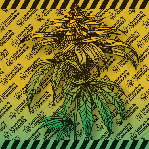
The yellow-to-green gradient is the signature surface. Add paper texture so it reads printed, not synthetic.
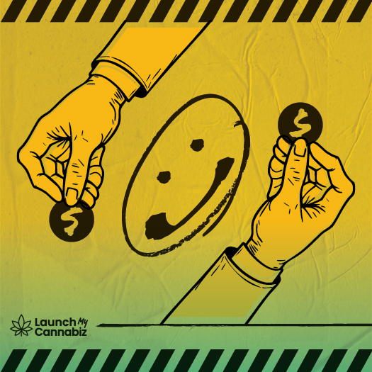
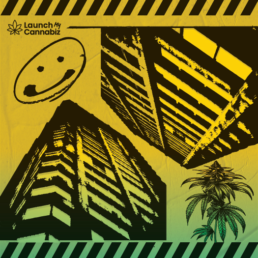
Heavy black strokes, caution stripes, halftone imagery, and handwritten annotations keep the system grounded.
The system revolves around the LaunchMyCannabiz wordmark, the cannabis leaf glyph, and the contrast between Poppins precision and Permanent Marker attitude.
The primary palette is small and loud: yellow, green, black, white, plus teal and red as secondary colors. Black text stays mandatory on yellow and gradient surfaces. Yellow text is not used on white, paper, or other light surfaces; use black text on yellow chips instead.
Poppins is the functional system face. Permanent Marker is a personality accent for one to three words, handwritten callouts, and annotated diagram moments.
LaunchMyCannabiz
Permits, funding, buildout, launch
Sign goes here
Components use strong black borders, small radii, hard offset shadows, uppercase labels, and icon support where the interface needs familiar actions.
Use black as a deliberate full-bleed brand moment, not as the default for every surface. Yellow text is the preferred hover color on black buttons.
Motion should feel confident and printed: no springs, no confetti, no glossy parallax. Hover can lift; press can flatten the hard shadow.
Spacing follows the 4px token scale. Lucide can stand in for product UI icons until a dedicated LMC icon set exists.
space-28pxTight control spacing, chip paddingspace-416pxForm padding, card insets, rule offsetsspace-632pxPanel gutters and section sub-blocksspace-864pxBig vertical breaks and hero spacingLMC defaults to squared or lightly rounded shapes. Pills are reserved for badges, filters, and compact UI labels.
The brand-aligned move is the hard black offset. Use blur sparingly and only where a product surface needs calmer depth.
Write like the brand is on the entrepreneur's side. Be direct, practical, and specific. Always use "cannabiz" for the product noun.
Use the primary and reversed logo assets as supplied. Do not stretch, recolor, add effects, or rebuild the lockup from type.
Use this lockup on white, paper, yellow, and the lighter range of the gradient. Keep enough clear space that the marker-style `My` stays distinct.
On black or other deliberately dark sections, swap to the reverse asset. Do not fake it by recoloring the light-surface logo in CSS.
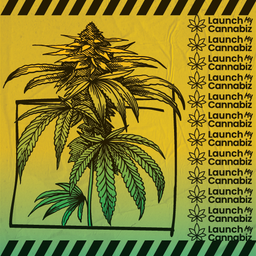
The most on-brand deployment is a logo placed on a yellow-to-green surface with paper texture, a black rule, and caution-stripe framing nearby. The logo should feel printed into a system, not floating alone.
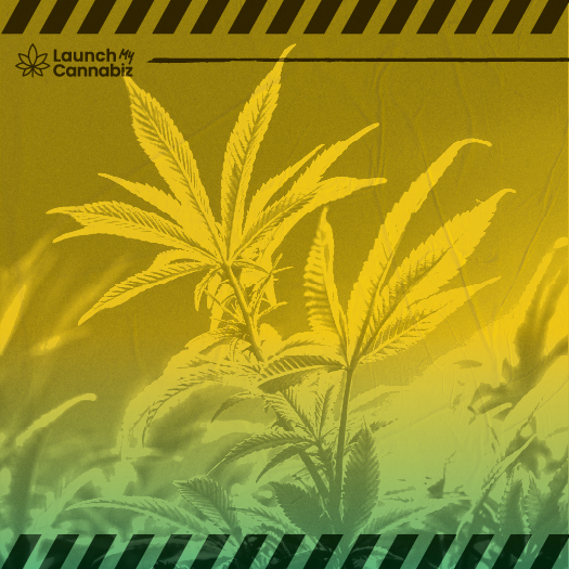
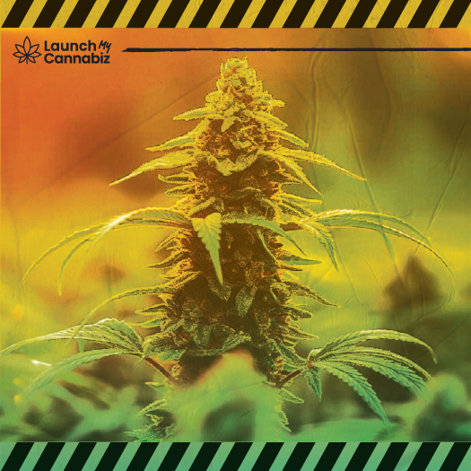
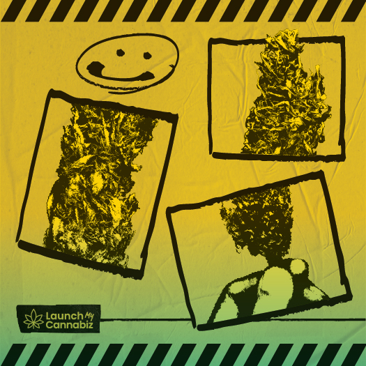
Most imagery is high-contrast halftone or heavy ink illustration. Naturalistic cannabis macro photography is rare and should anchor real-product moments.
LMC already behaves like a sister system inside the Launch family. It shares the operator-first posture and useful-document mindset, but swaps the Launch geometric polish for a louder poster-build cannabis voice.
The system should hold up on practical field objects too. Swag works best when it keeps the same black-ink framing, loud yellow surfaces, and operator-first clarity as the rest of the brand.
This page should route directly into usable assets: preview cards, a marketing UI kit, a capabilities statement, and reusable HTML artifacts that can be lifted into production or adapted for campaigns.
A usable shelf of LMC applications already lives in this folder. The homepage should make those artifacts discoverable, not hide them behind placeholders.